A warm, playful restaurant identity that brings Nonna’s TABLE into a contemporary setting through illustration, expressive type and food-inspired colour.
PATCH CREATIVE STUDIO / Case Study
THE IDEA
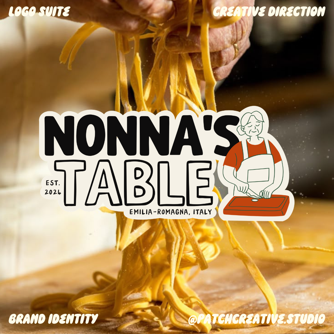
Nonna’s Table began with a simple creative idea: make an Italian restaurant identity feel as welcoming as an invitation into a family kitchen. The brand story connects recipes passed down through generations in Emilia-Romagna with the fresh energy of Toronto’s food scene.
I developed an identity around that balance, combining an illustrated Nonna, expressive typography, and a food-inspired palette. The work extends from the logo into menus, packaging, signage, merchandise, and social content, carrying the same sense of welcome across each application.
THE CHALLENGE
How do you communicate tradition without making a restaurant feel formal or stuck in the past? I wanted Nonna’s Table to feel familiar and generous, but also playful and contemporary. The identity needed to work beyond a single logo: at the entrance, on the table, on takeaway packaging, and on a phone screen.
Project: Restaurant Brand Identity.
My Role: Creative Direction, Brand Identity Designer.
Scope: Logo Suite, Colour and Typography, Menu, Packaging, Signage, Merchandise, and Social Graphics.
FINDING THE VISUAL DIRECTION
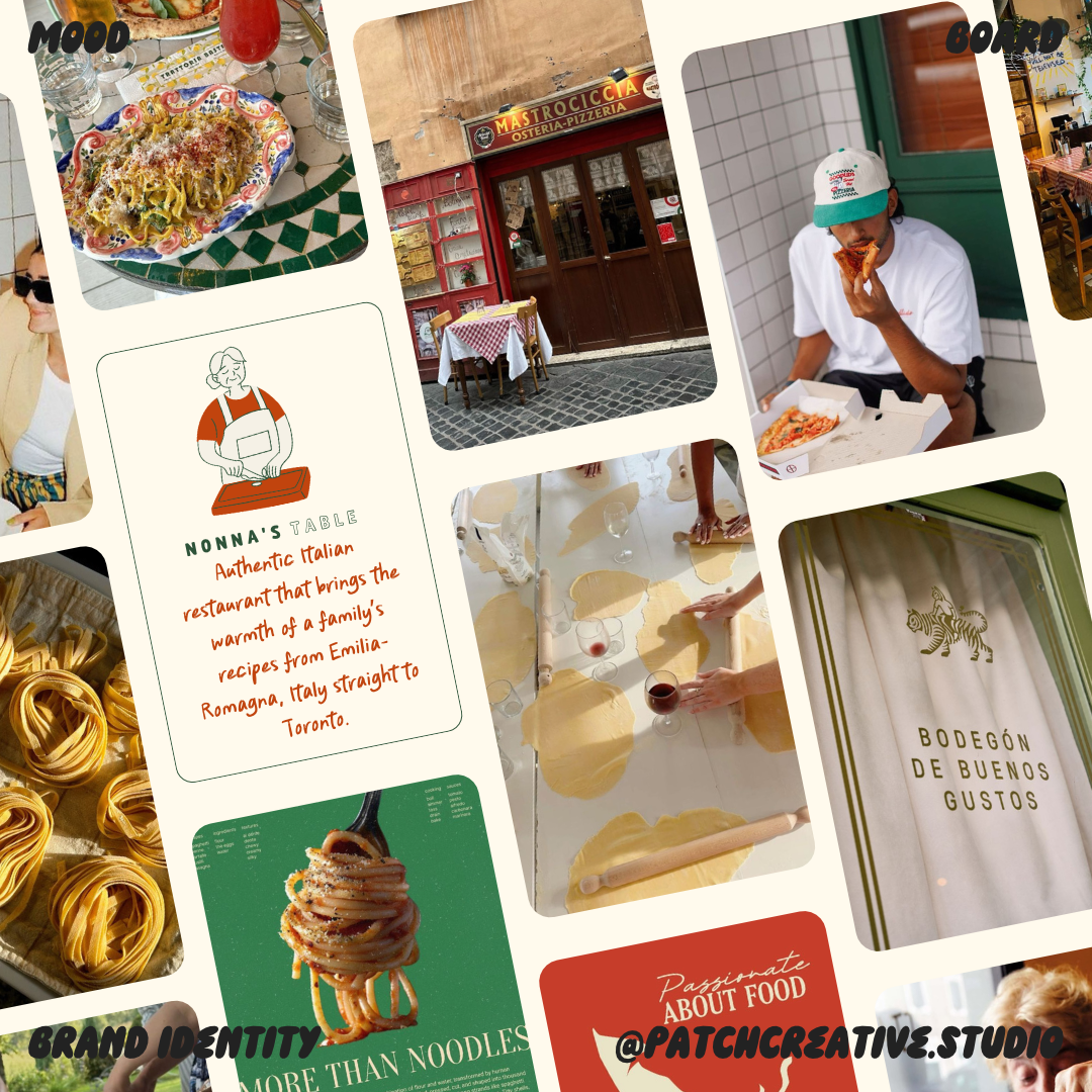
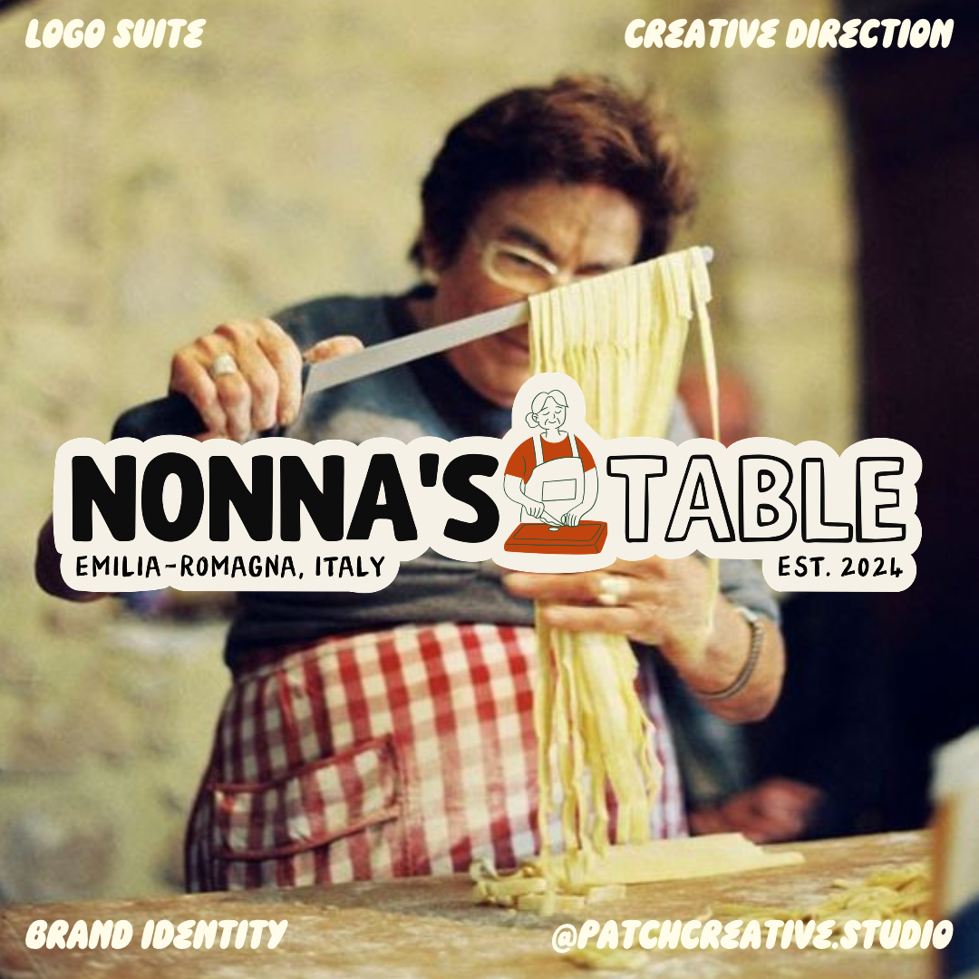
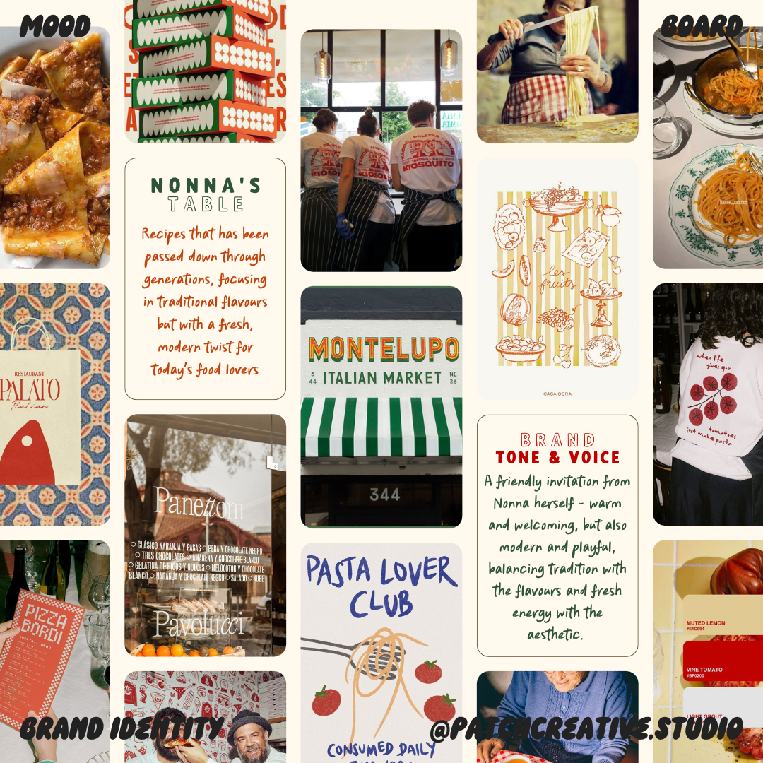
The mood boards brought together pasta-making, family recipes, neighbourhood restaurant signs, market imagery, and contemporary food branding. The central idea was a friendly invitation from Nonna herself: warm and welcoming, with a modern, playful edge.
Rather than treating tradition and modernity as opposites, I paired familiar culinary references with bolder lettering and flexible compositions. That direction informed the character illustration, logo arrangements, colour choices, and supporting graphics.
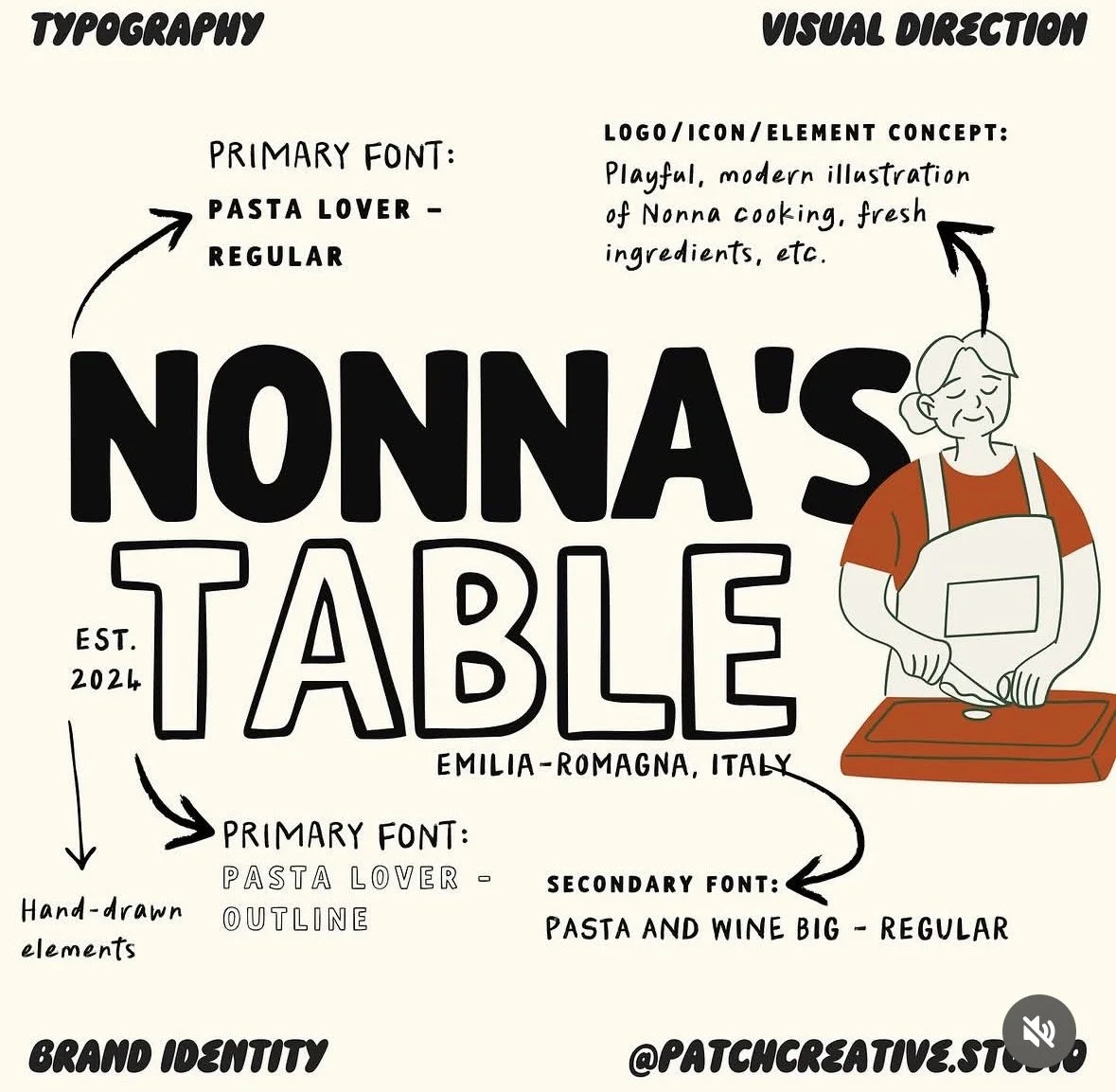
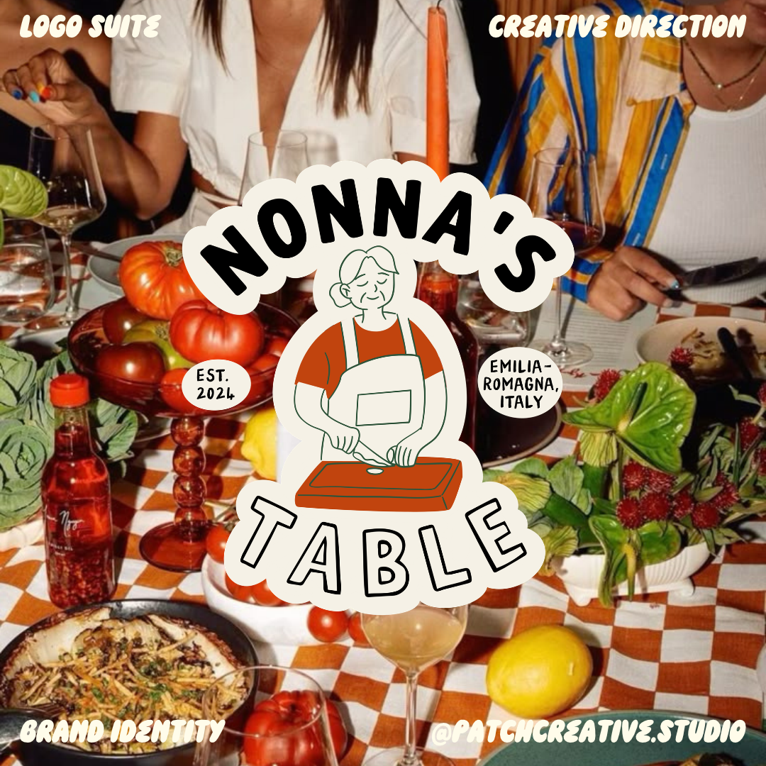
PUTTING NONNA AT THE CENTER
The mood boards brought together pasta-making, family recipes, neighbourhood restaurant signs, market imagery, and contemporary food branding. The central idea was a friendly invitation from Nonna herself: warm and welcoming, with a modern, playful edge.
Rather than treating tradition and modernity as opposites, I paired familiar culinary references with bolder lettering and flexible compositions. That direction informed the character illustration, logo arrangements, colour choices, and supporting graphics.
TYPOGRAPHY WITH A PLAYFUL TWIST
Pasta Lover Regular and Pasta Lover Outline create the contrast within the main wordmark: solid lettering for ‘Nonna’s’ and outlined lettering for ‘Table’. The combination gives the name a bold presence without making every letter carry the same visual weight.
Pasta and Wine Big Regular adds handwritten character to supporting details. Together, the type choices balance a strong introduction with a more informal, personal tone.
AN IDENTITY BEYOND THE LOGO
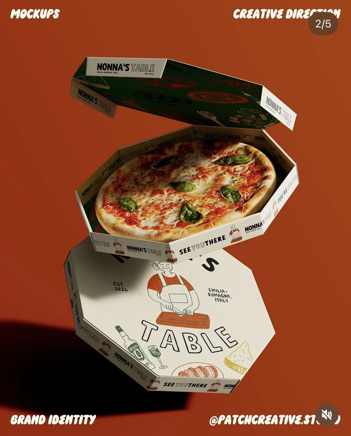
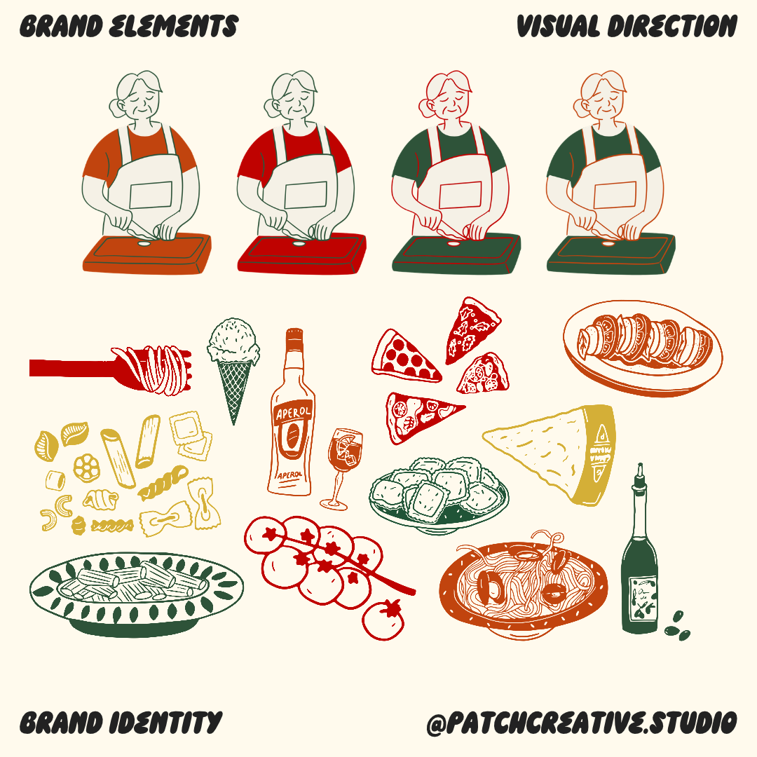
Supporting illustrations of pasta, pizza, tomatoes, cheese, and other food elements extend the visual story. They bring variety to the applications while staying connected through colour and linework.
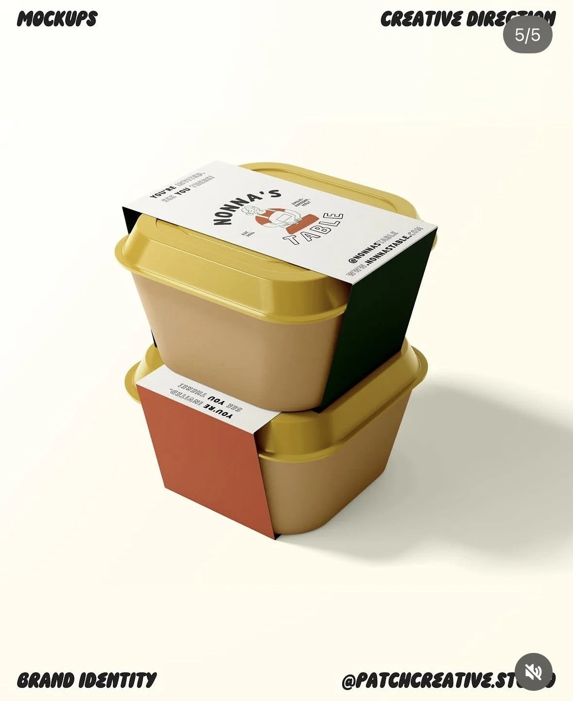
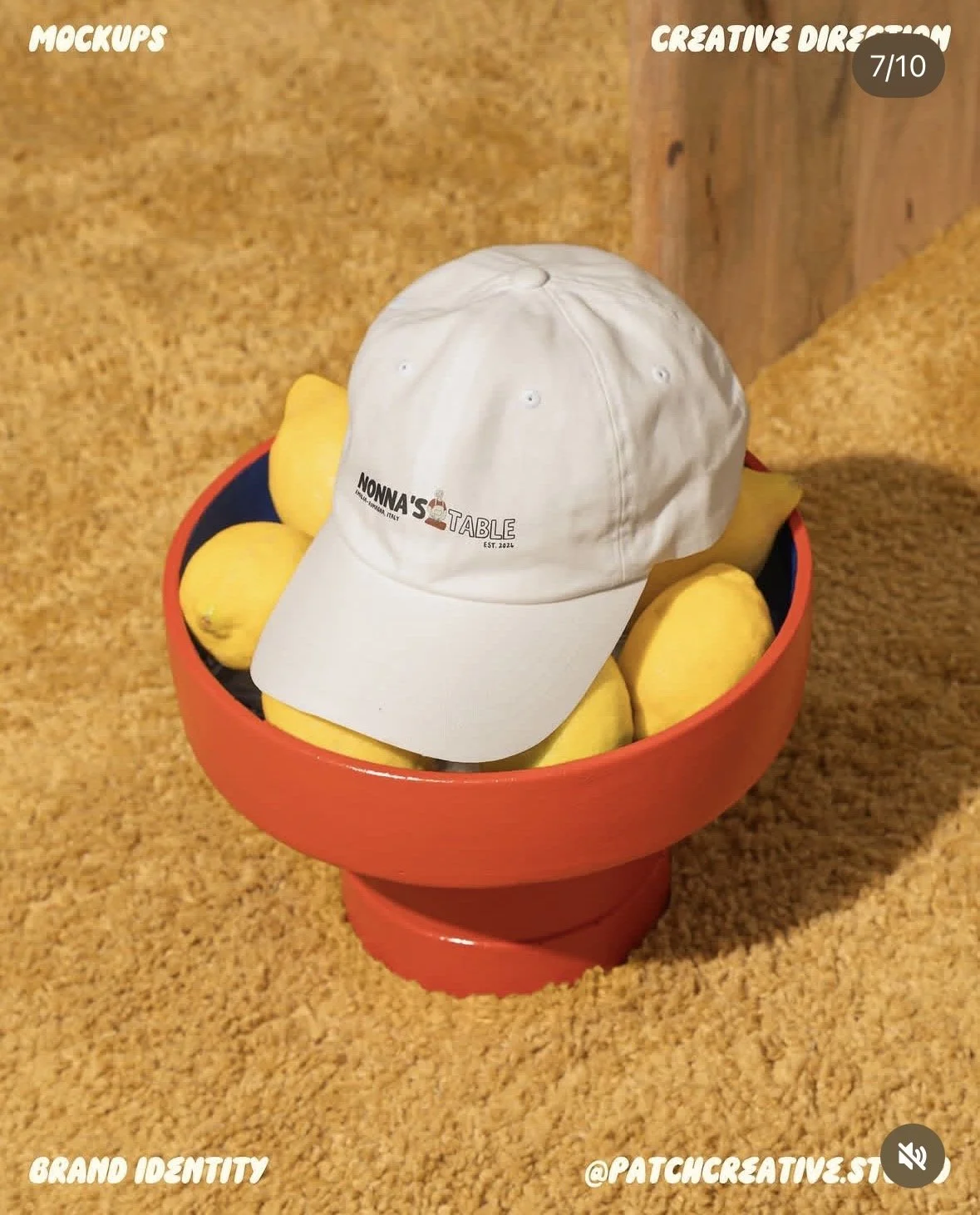
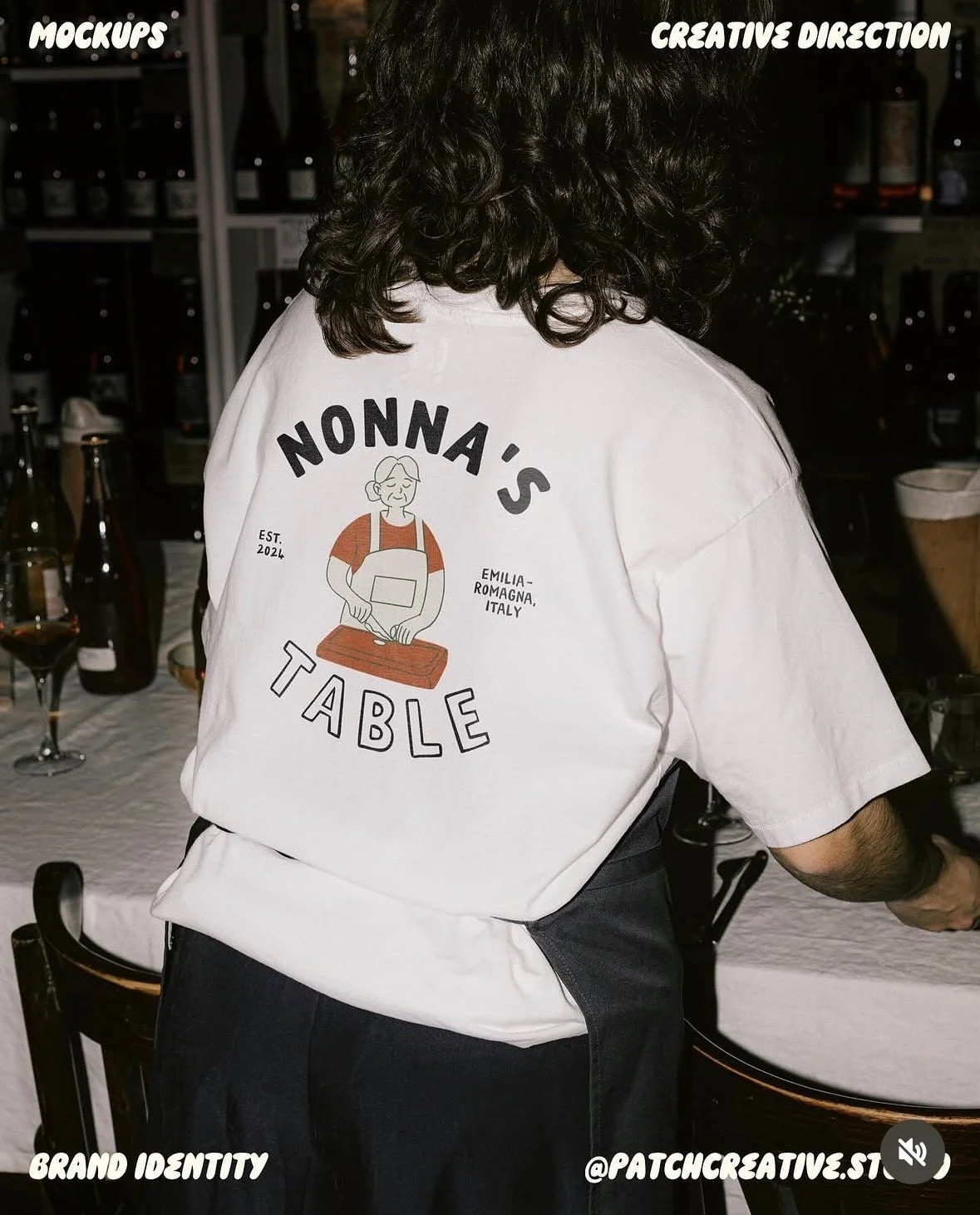
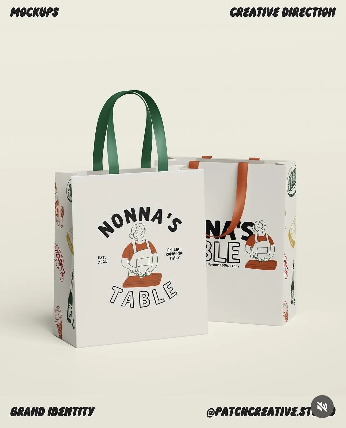
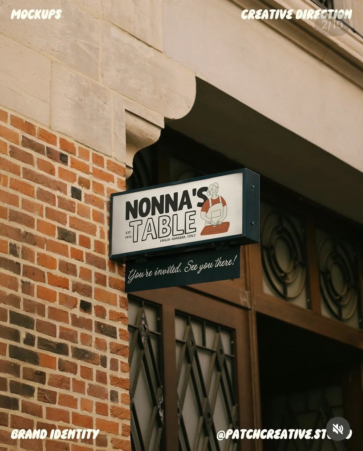
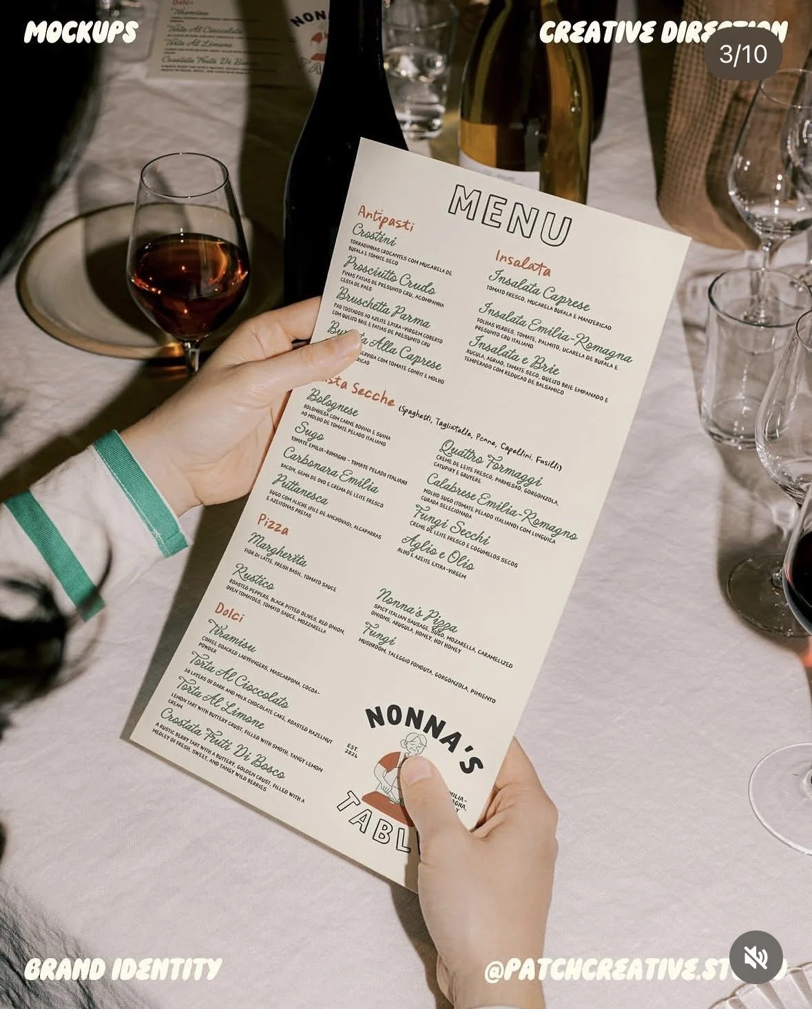
The menu uses a cream background with coloured headings and expressive dish names. Signage and apparel give the logo more space, keeping the name and Nonna illustration prominent. Pizza boxes, carry bags, and takeaway sleeves combine the logo with food illustrations and contrasting colour panels, bringing the identity into the take-home experience.
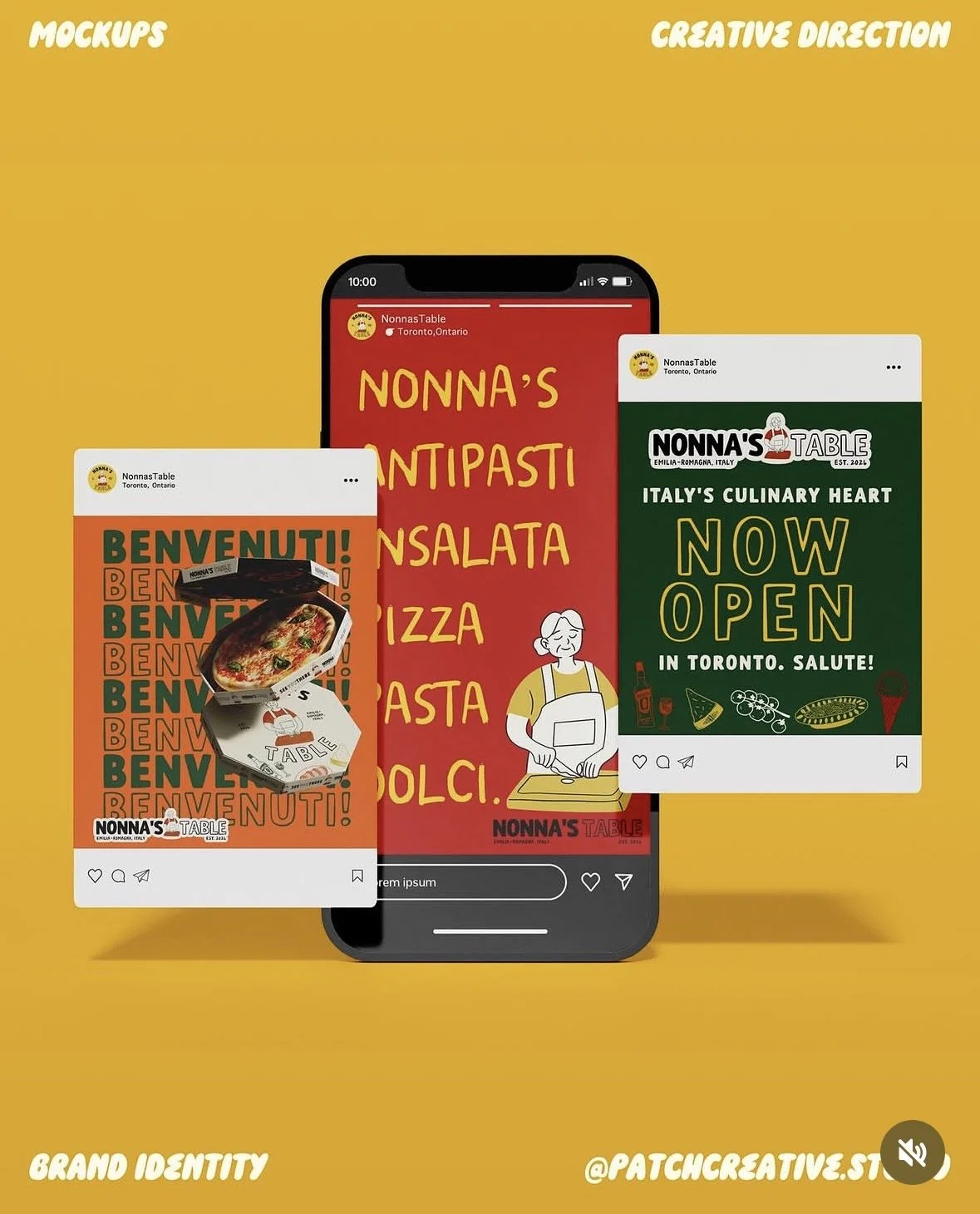
The social graphics take a bolder approach, using saturated backgrounds, repeated lettering, and short messages such as ‘Benvenuti!’ and ‘Now Open’. The layouts change to suit the format, but the character, colours, and typography keep them connected.
A PALETTE INSPIRED BY THE KITCHEN
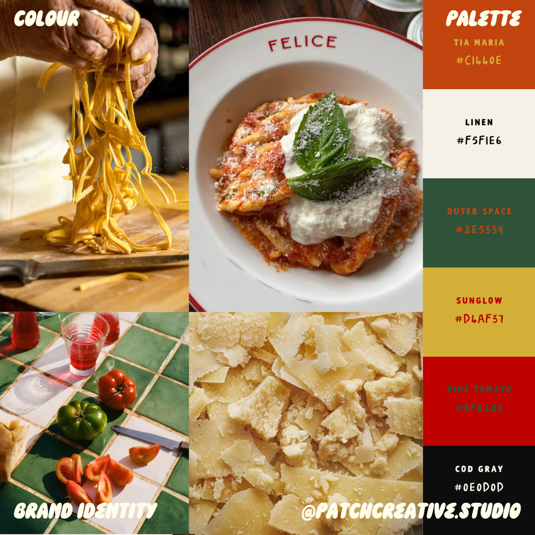
Tomato red and burnt orange bring warmth to the palette. Golden yellow draws on fresh pasta and Parmigiano, while deep green connects with the landscape inspiration behind the brand. Cream and near-black provide a quieter base for the brighter colours.
The palette creates room for both a restrained menu and more colourful packaging or social graphics without making them feel like separate brands.
THE FINISHED DIRECTION
The finished work brings the warmth of a family kitchen into a playful restaurant identity. Across the mockups, each application has its own composition rather than simply repeating the same layout.
For me, the strength of Nonna’s Table is that the story continues beyond the main logo. The illustrated character introduces it, and the surrounding colours, type, and food imagery carry it through the rest of the experience.
“A BRAND THAT WELCOMES PEOPLE BEFORE THEY REACH THE TABLE”.