A colourful Mexican food-truck identity, pairing bold lettering and playful food graphics across menus, packaging, signage and merchandise mockups.
PATCH CREATIVE STUDIO / Case Study
THE IDEA
For Nomad Nachos, I developed a Mexican food-truck identity around the idea of food on the move. An illustrated truck connects directly to the name, while bold lettering and colourful food graphics give the brand an informal, playful feel.
I carried that direction into menus, takeaway packaging, signage and merchandise mockups.
THE CHALLENGE
I needed to balance the bold wordmark with a detailed set of illustrations, keeping the name and menu information prominent. The identity also had to adapt to very different proportions, from the wide side of a truck to a menu or a small packaging seal.
The challenge was giving each application room for its own layout while keeping the overall identity consistent.
Project: Food Truck Brand Identity.
My Role: Creative Direction, Visual Identity Designer.
Scope: Logo Variations, Illustrations, Typography, Menu & Packaging Design, Signage, and Printed Collateral.
THE TYPOGRAPHY
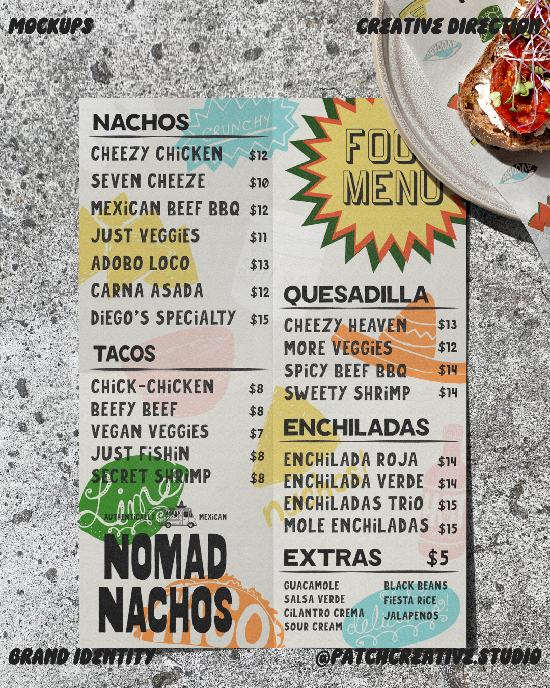
The lettering carries much of the personality. I paired the heavy wordmark with narrower, textured lettering for menu items, bold category headings, and outlined display type.
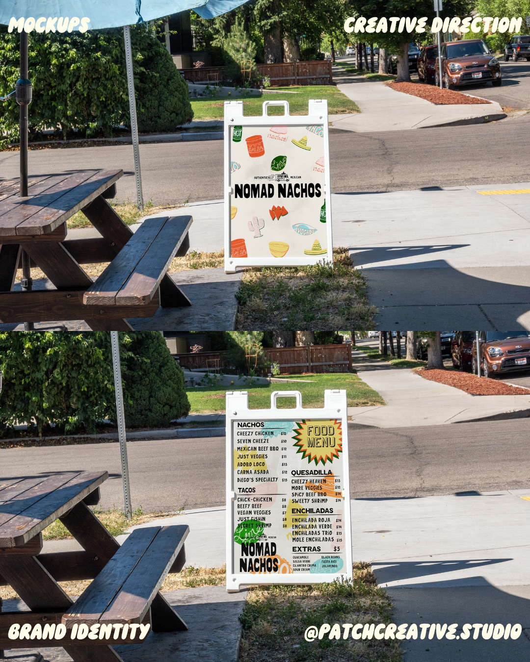
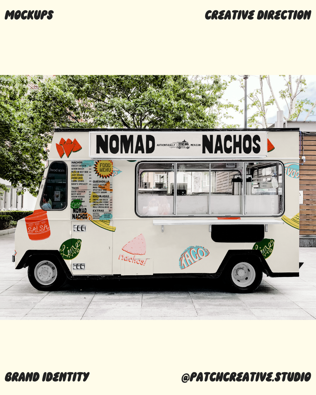
On the menu, a two-column layout and underlined headings organise the different food categories. The large “Food Menu” starburst adds a focal point, while smaller script details within the illustrations keep the overall tone informal.
ILLUSTRATIONS ACROSS THE IDENTITY
Illustrated tacos, nacho chips, limes, salsa jars, and hot-sauce bottles give the identity a recurring set of graphics. Cacti, sombreros, and other motifs add variety, with textured linework and lettering connecting the pieces.
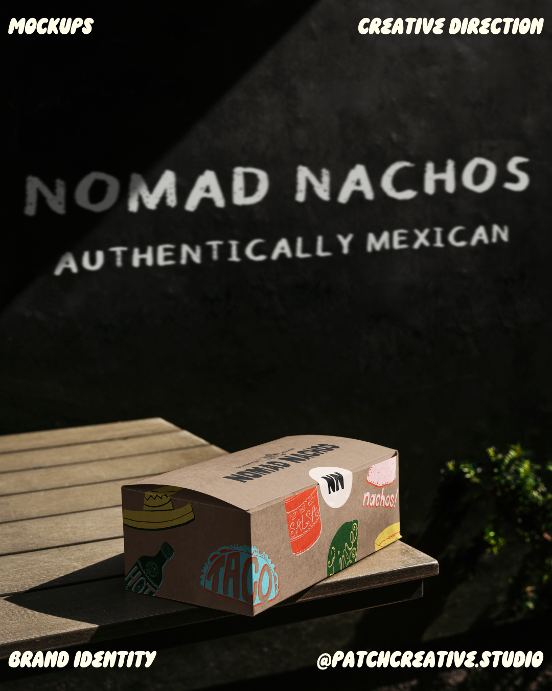
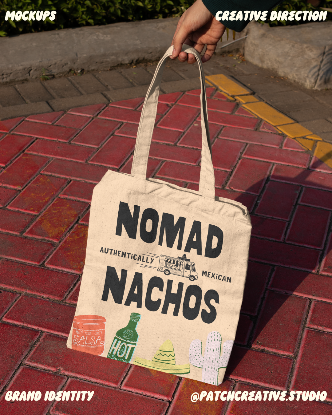
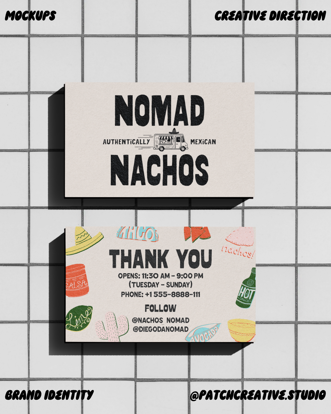
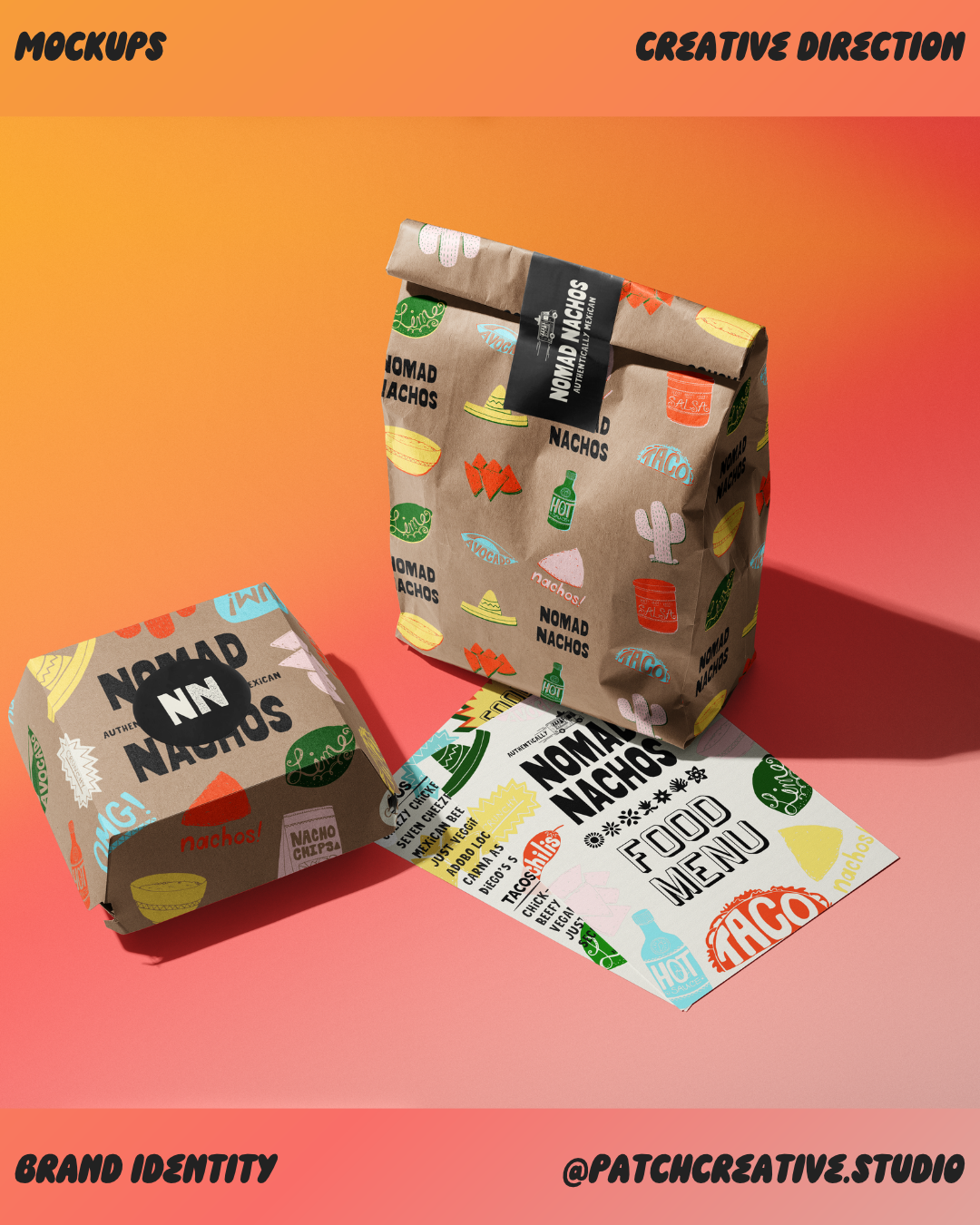
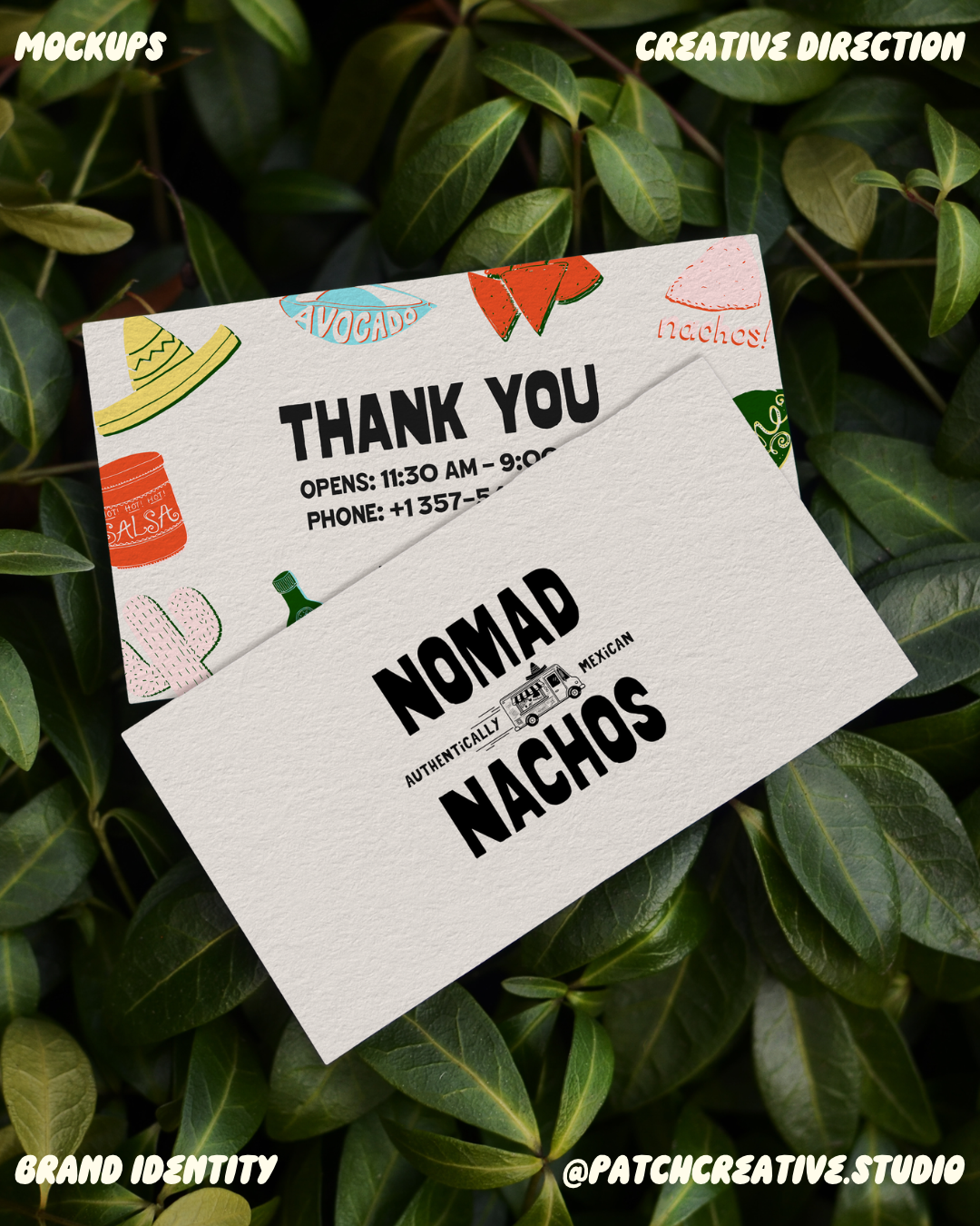
I treated the illustrations as a repeatable set of brand elements, adjusting their scale and spacing for each format. They become an all-over pattern on the bag and food box, a border on the thank-you card, and a smaller cluster on the tote. Repetition connects those different layouts back to the same identity.
BRINGING THE IDENTITY INTO CONTEXT
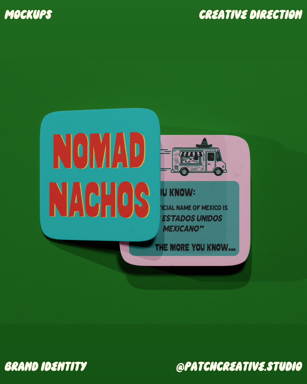
I extended the design across mockups of a food truck, an A-frame sign, menus, takeaway packaging, a thank-you card, a tote, and coasters.
The truck gives the name the largest area, positioned above the service window, with illustrations spread across the bodywork. The A-frame has one face centred on the logo and another displaying the menu.
The packaging brings the elements closer together through repeated graphics, a black sealing label, and compact NN stickers. These applications show how the identity can vary in density while keeping its main elements consistent.
THE FINISHED DIRECTION
For me, the strength of Nomad Nachos is how the bold name and playful details work together across the mockups. The truck gives the wordmark space, while the packaging brings the illustrated elements into focus. Each format has its own composition, with enough shared detail to feel connected.
THE NAME AND THE TRUCK
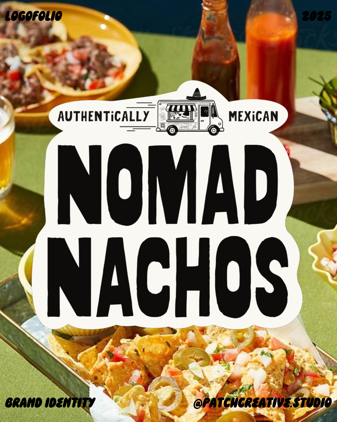
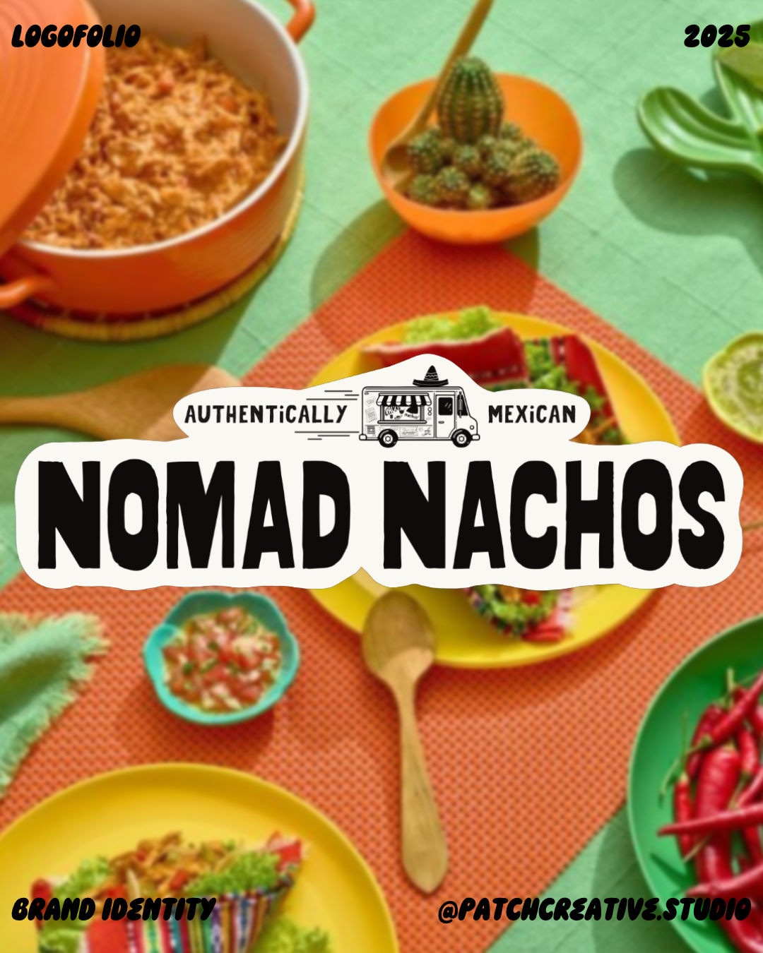
I made the name the most prominent part of the logo, with the smaller truck illustration and “Authentically Mexican” line forming a second level of information. This visual hierarchy keeps the brand name in focus while connecting the identity to a mobile kitchen. The motion lines reinforce that link.
I used stacked and horizontal arrangements to suit different proportions. The stacked version gives cards and tote bags a strong centre; the horizontal version extends across signage. On the packaging, an NN sticker provides a compact companion to the full name.
A LIVELY PALETTE ON A SIMPLE BASE
I kept black and warm cream at the centre of the layouts, adding orange-red, yellow, green, turquoise and pale pink through the illustrations and supporting graphics. The bright accents give the identity energy, while the pale backgrounds leave room for the name and information.
The kraft-coloured packaging adds another neutral surface. On the coaster mockup, I used a more saturated combination of turquoise, orange-red, and pink.