I developed a playful BRAND identity, pairing a smiling mascot with soft colours across packaging, printed collateral and merchandise mockups.
PATCH CREATIVE STUDIO / Case Study
THE IDEA
For Momo’s Mochi, I wanted to turn the soft, cheerful character of mochi into a brand that felt friendly and inviting. I built the identity around a smiling mascot, rounded shapes, and a soft palette, carrying the idea of “happiness in every bite” from the logo into packaging and printed pieces.
THE CHALLENGE
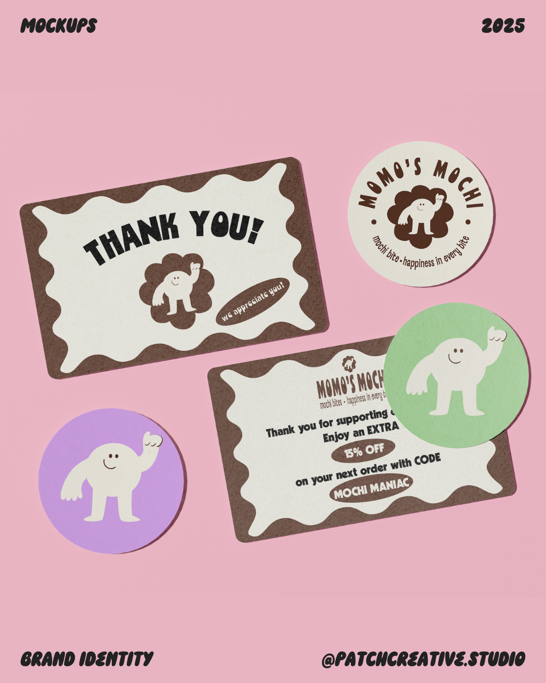
I needed the identity to feel playful while keeping its information organised. The mascot, expressive lettering, and several colour combinations had to work together on a small sticker, a detailed insert, or a pouch covered in flavour names. The challenge was giving each flavour and format its own expression while keeping Momo’s Mochi recognisable.
Project: Mochi Brand Identity.
My Role: Creative Direction, Brand Identity, and Brand Applications.
Scope: Logo Suite, Colour and Typography, Menu, Packaging Concepts, Printed Collateral, and Merchandise.
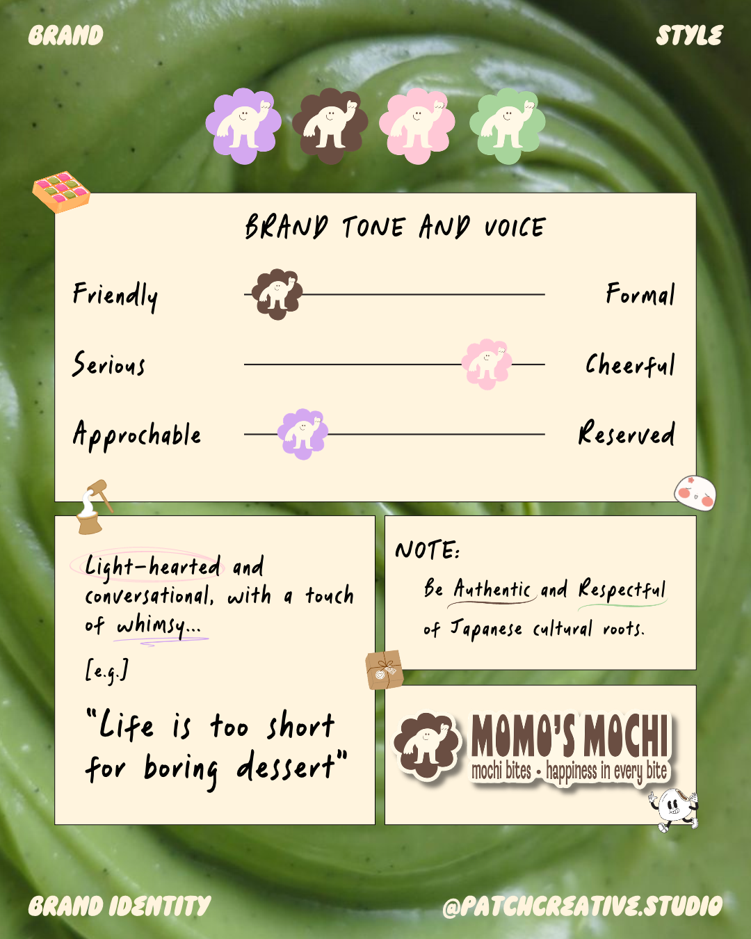
SETTING THE DIRECTION
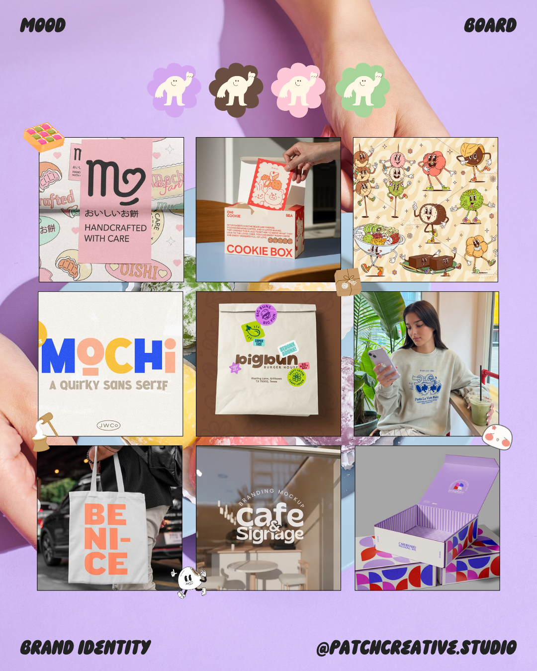
The mood board brought together character illustrations, expressive typography, and packaging references. I translated that direction into three qualities for the brand: friendly, cheerful, and approachable.
Those qualities shaped the language as well as the visuals. Short lines such as “More Mochi, More Smiles” complement the smiling character and scalloped shapes, giving the identity a consistent personality across words and images.
A CHARACTER AT THE CENTRE
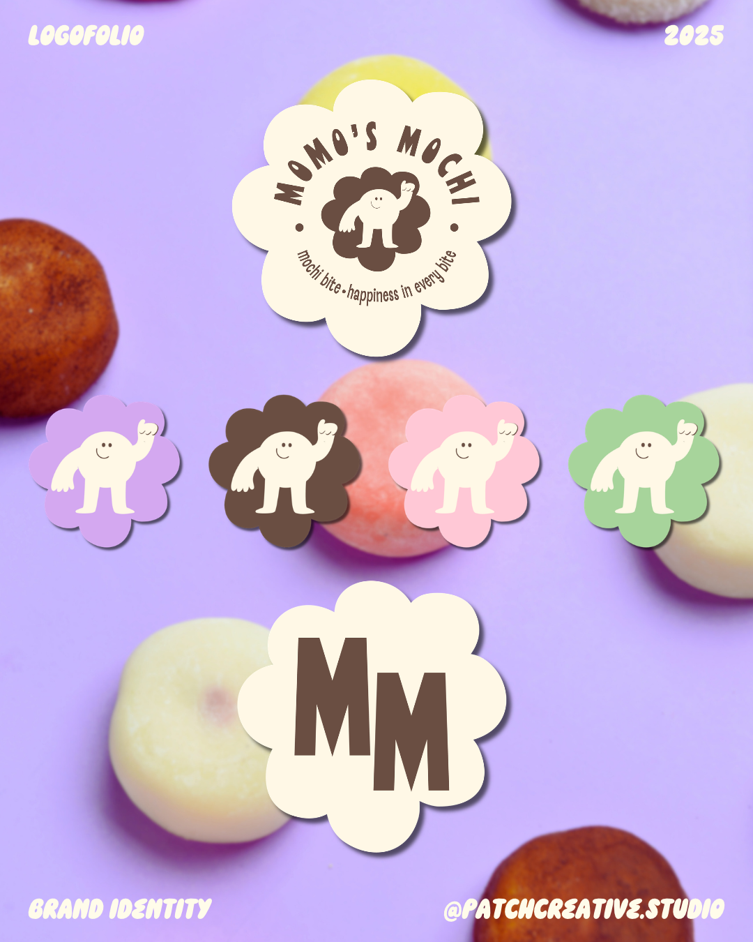
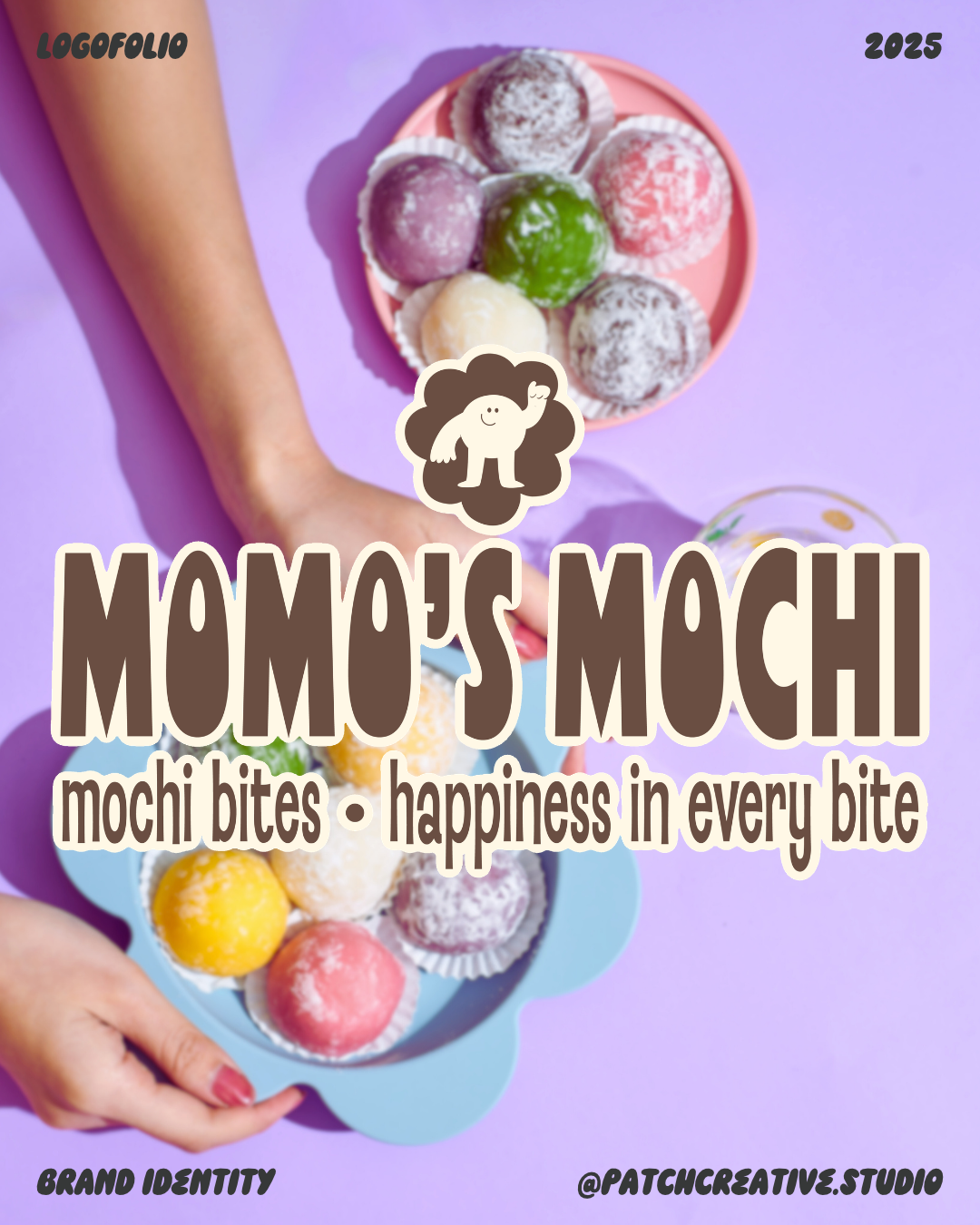
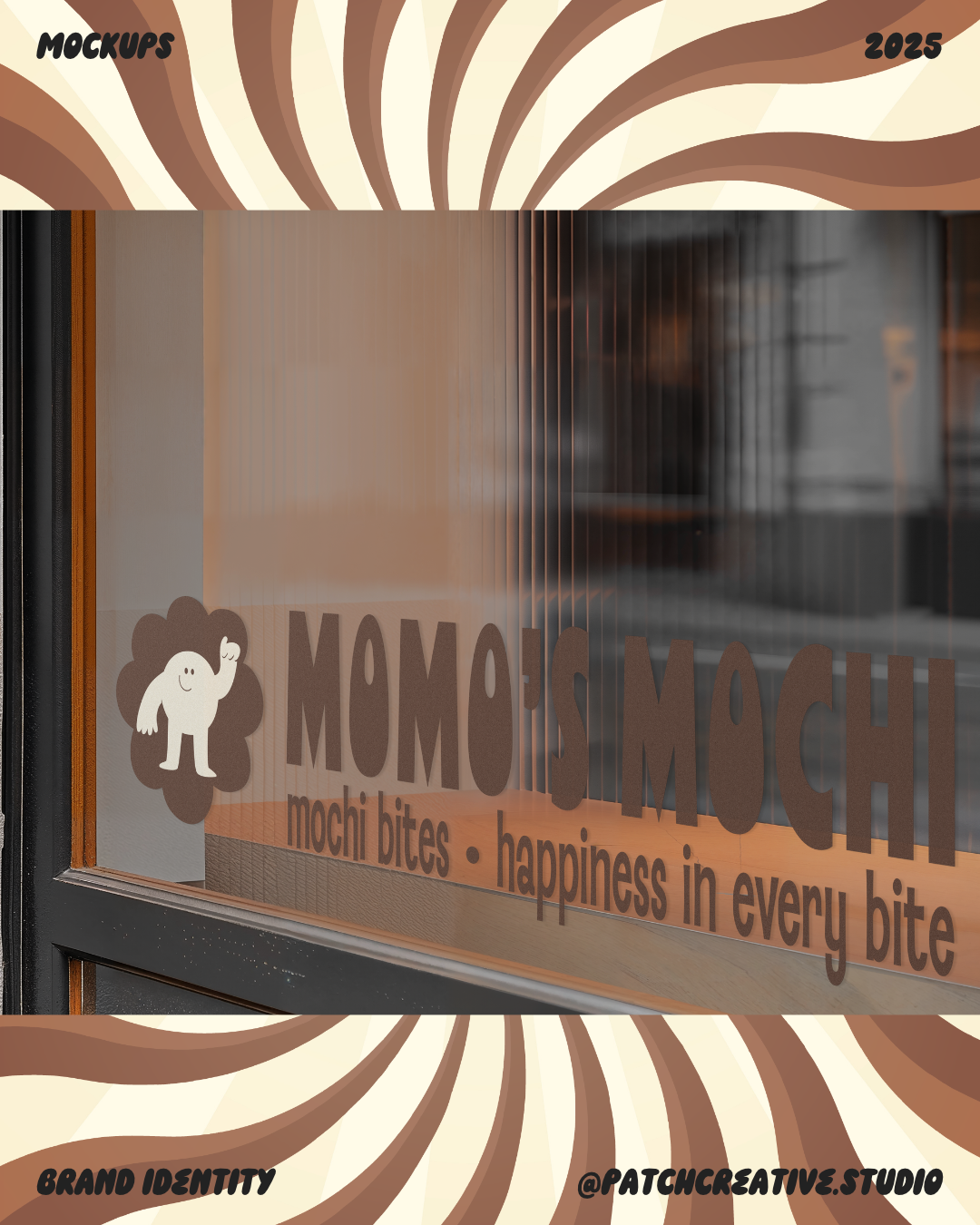
I built the logo system around a cream mascot on a scalloped flower shape. Its rounded silhouette connects with the softness of the product, while the brown and cream pairing gives the character a defined outline.
I developed centred and horizontal logo arrangements, a curved badge, individual mascot icons, and an MM monogram. These variations let me change how much detail appears in each space, with the scalloped shape connecting the simpler marks to the wider identity.
THE FINISHED DIRECTION
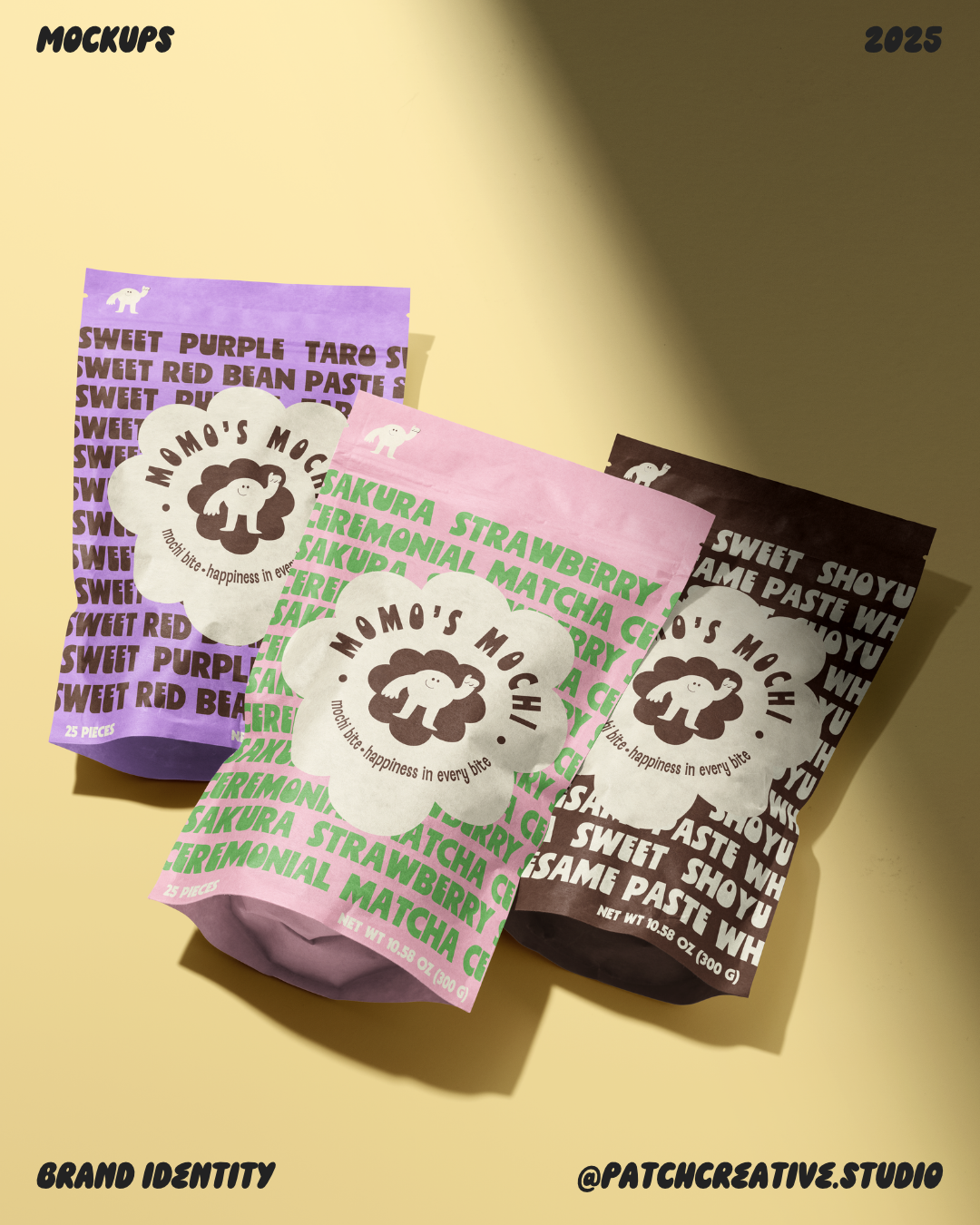
The pouch family is the clearest expression of the idea: the flavour colours change, but the mascot and badge hold the range together. For me, that balance is the strength of the project. It gives Momo room to be playful across different applications while keeping a consistent identity.
COLOUR PALETTE AND COMBINATIONS
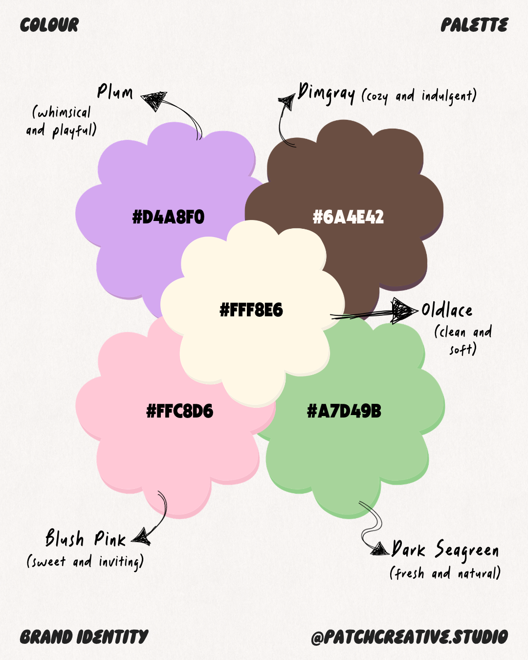
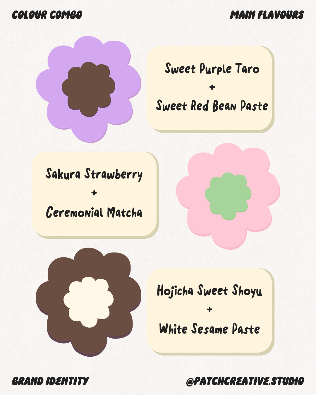
I paired lavender, pink, and green with warm brown and cream. The softer colours support the cheerful tone, while brown and cream give the system a common base.
I also used colour to separate the flavour combinations: lavender and brown for taro and red bean; pink and green for strawberry and matcha; and brown and cream for hojicha and white sesame. On the pouch mockups, each pairing changes while the central badge stays consistent, giving the range variety within one system.
TYPOGRAPHY THAT CARRIES THE PACKAGING
I used bold display lettering for the name and flavour names, with narrower text for the tagline and smaller type for supporting information. The difference in scale gives the layouts a clear hierarchy.
On the pouches, repeated flavour names become the background pattern. A cream scalloped badge interrupts the pattern, bringing the brand and mascot into focus. This lets the typography do two jobs: identify the flavour combination and add energy to the packaging.
AN IDENTITY BEYOND THE POUCH
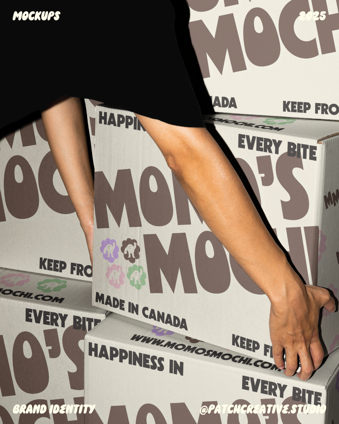
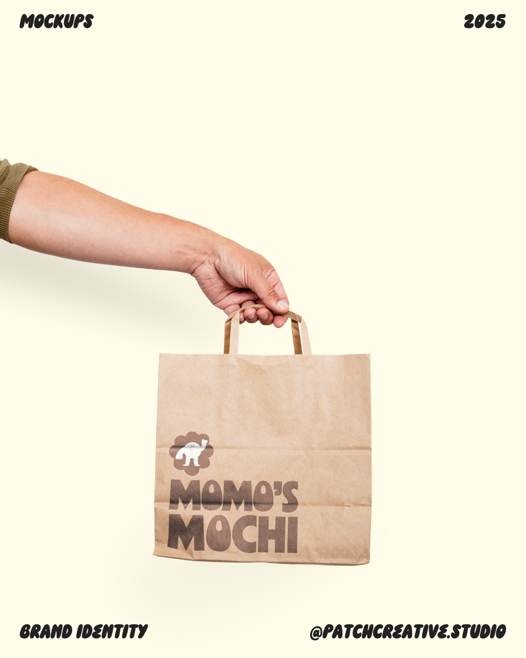
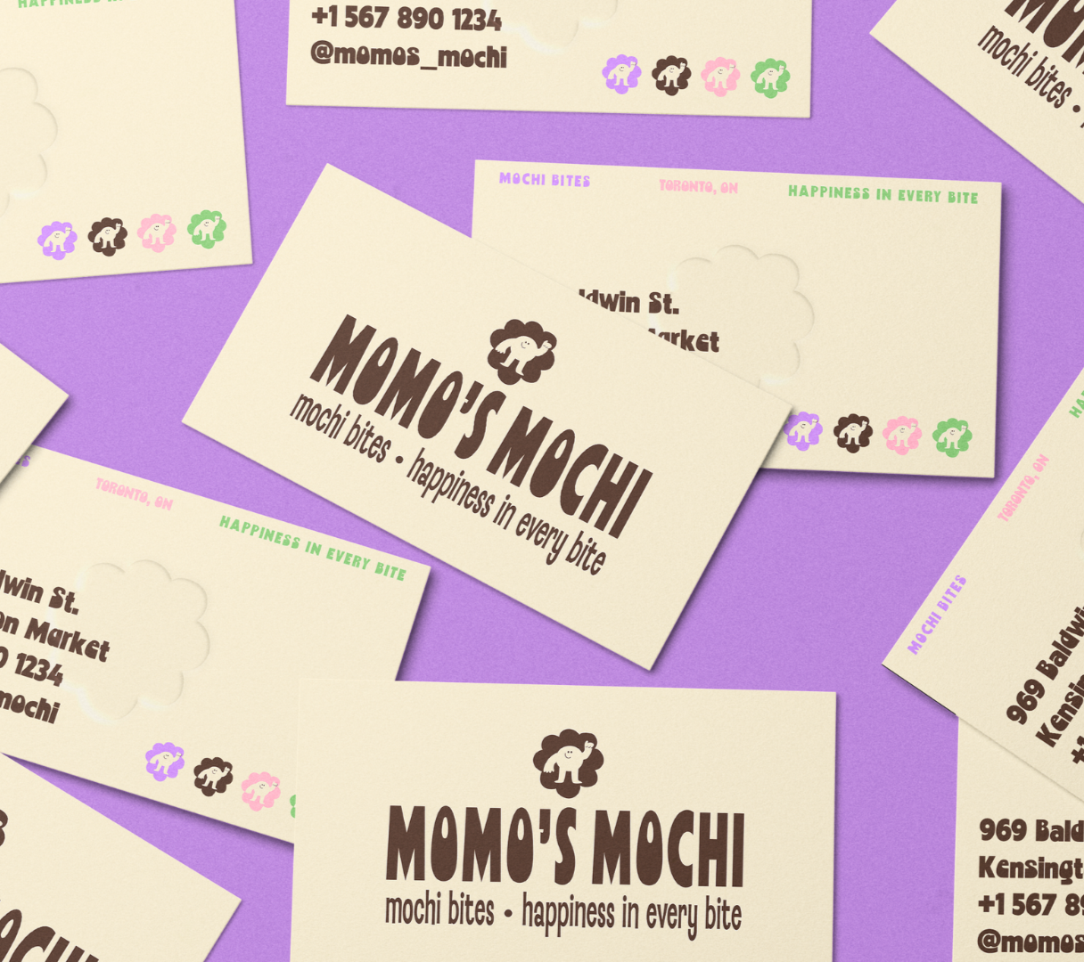
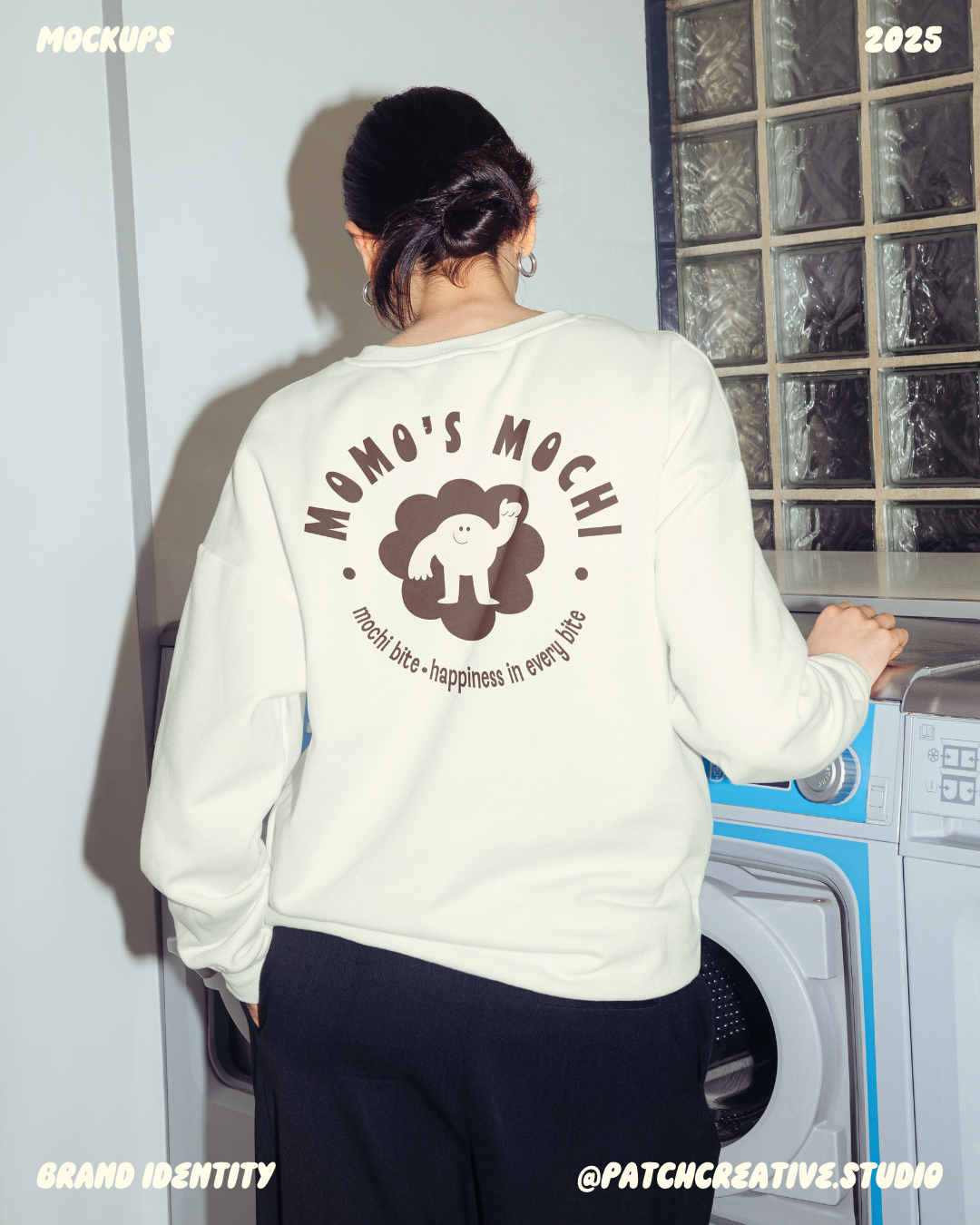
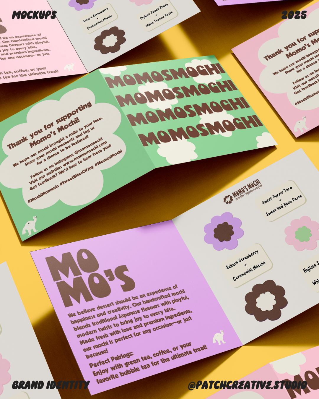
I extended the identity into mockups of business cards, thank-you cards, stickers, folded inserts, shipping boxes, a shopping bag, and a sweatshirt. The inserts use sections to organise more detailed information, while the bag and sweatshirt give the mascot and brown lettering more space.
Across the set, I varied the density of the layouts and repeated the same core elements to keep the applications connected.